A trading timeframe is the interval of market activity represented by each price bar or candle. A one-minute chart groups one minute of trading into each bar, while a daily chart groups an entire session into each bar.
The main limitation is that a timeframe changes compression, not market reality. A lower timeframe is not automatically more precise, and a higher timeframe is not automatically more reliable; each interval reveals some behavior while hiding other behavior.
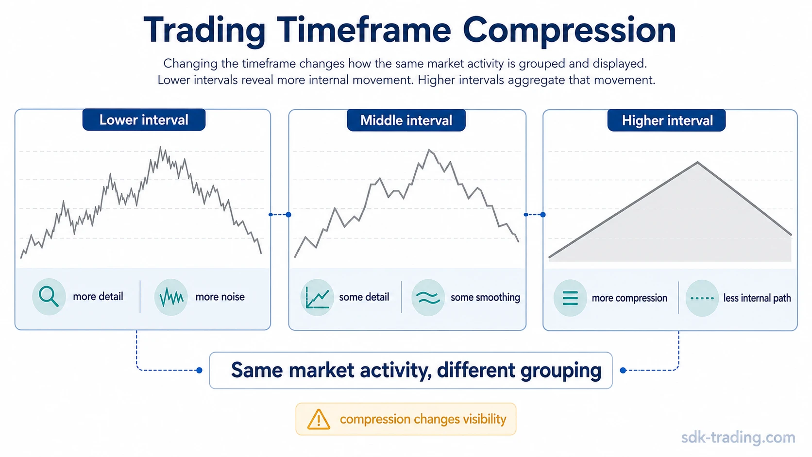
The same buying, selling, and price negotiation can look noisy on a lower chart and smoother on a higher chart because the information is grouped differently.
Definition: A trading timeframe is the chart interval used to organize price data into bars or candles, such as 1-minute, 15-minute, 1-hour, daily, weekly, or monthly intervals.
Key Points
- A timeframe controls how much market activity is included in each candle or bar.
- Lower timeframes reveal more internal movement, but they can also make ordinary fluctuation look more significant.
- Higher timeframes aggregate movement, which can make structure easier to read while hiding smaller rotations.
- No timeframe creates prediction or confirmation by itself; it only changes the level of detail being observed.
What a Trading Timeframe Represents
A timeframe is a charting lens. It determines how price data is packaged across time, not whether the market is bullish, bearish, strong, weak, predictable, or confirmed.
On a 5-minute chart, each candle summarizes five minutes of price movement. On a 1-hour chart, each candle summarizes sixty minutes. On a weekly chart, each candle may contain several sessions of movement that would appear as many separate swings on lower intervals.
The practical limit is that more detail does not always mean better information. A lower timeframe may reveal a quick rejection, pause, or rotation, but that movement may still be minor inside a broader candle. A higher timeframe may reduce noise, but it can also hide the internal struggle that produced the final bar.
Why the Same Move Looks Different Across Timeframes
The same price movement can look different because each timeframe compresses a different amount of activity. A move that appears sharp on a 5-minute chart may be only a small upper wick on a daily candle. A calm-looking daily candle may contain several intraday advances, pullbacks, and failed recovery attempts.
This difference can create apparent disagreement between charts. A lower timeframe may show a short-lived reversal while a higher timeframe still shows a broader advance. A higher timeframe may show a clean trend while a lower timeframe shows repeated pauses and counter-moves inside that trend.
Trading timeframe example: Price advances during the morning, briefly tests a prior intraday high, pulls back into the range, and then closes near the middle of the daily candle. On a 5-minute chart, that sequence may look like several separate swings. On a daily chart, the same movement may appear as one candle with an upper wick and a neutral close.
One chart is not automatically right while the other is wrong. Each chart is showing a different level of compression.
Short, Medium, and Long Trading Timeframes
Timeframes are often grouped by horizon because each group emphasizes a different layer of market movement. The exact labels can vary by trader, market, and charting platform, but the structural tradeoff is consistent: lower intervals expose more detail, while higher intervals absorb more detail into broader bars.
| Timeframe group | Common chart intervals | What it tends to reveal | What it can hide or exaggerate |
|---|---|---|---|
| Short timeframe | 1-minute, 5-minute, 15-minute | Internal movement, quick reactions, local pauses, and short-lived rotations. | Normal fluctuation can look more meaningful than it is when viewed without broader context. |
| Medium timeframe | 30-minute, 1-hour, 4-hour | Intermediate swings, developing structure, and how smaller rotations connect. | Some lower-timeframe detail is absorbed, so the internal path may look cleaner than it felt in real time. |
| Long timeframe | Daily, weekly, monthly | Broader directional phases, larger ranges, and longer structural transitions. | Many smaller advances, pullbacks, and failed attempts can disappear inside a single candle. |
The same market can therefore look active, choppy, calm, or directional depending on how much activity each bar contains. That is a compression effect, not a separate market condition.
How Multiple Timeframes Change Context
Multiple timeframes are useful because they separate broader structure from internal detail. A higher timeframe can show whether price is moving inside a larger range, broad advance, broad decline, or transition area. A lower timeframe can show how price is rotating inside that larger structure.
That comparison helps prevent one-dimensional chart reading. A lower-timeframe move may look decisive until it is compared with the broader bar that contains it. A higher-timeframe candle may look simple until the lower chart reveals how much movement occurred inside it.
Higher chart intervals can also make broader market cycles easier to observe because many smaller rotations are absorbed into larger phases. Lower intervals then help explain how those phases are forming internally.
Safe interpretation: Multi-timeframe reading compares context and detail. It does not turn a lower timeframe into an entry trigger or a higher timeframe into proof that a market will continue in one direction.
Common Timeframe Mistakes
The most common mistake is switching timeframes until the chart supports a preferred view. A market that looks weak on a lower interval may still be contained inside a broader range. A market that looks strong on a higher interval may still contain lower-timeframe rejection or unstable movement.
Timeframe reading filter: Before changing chart intervals, define the observation first. What is being checked: broad structure, intermediate rotation, or internal movement? What does the chosen interval hide? Would the same conclusion still make sense after broader compression?
| Mistake | Why it happens | Safer reading |
|---|---|---|
| Using lower-timeframe noise as structural evidence | Short intervals show many small swings and reactions. | Check whether the move is still meaningful after broader compression. |
| Treating higher-timeframe smoothness as certainty | Large candles absorb smaller internal rotations. | Remember that a clean higher-timeframe bar may contain unstable lower-timeframe movement. |
| Switching intervals to justify a view | Different compressions can make the same move look stronger or weaker. | Choose the observation question first, then use the timeframe that matches that question. |
| Searching for one perfect timeframe | Short, medium, and long intervals each reveal different information. | Treat timeframe selection as a context tool, not as a prediction method. |
Trading Timeframe Example Across Chart Intervals
Price moves upward from the open, briefly tests a prior intraday high, fails to hold the higher part of the range, and closes near the middle of the session. On a 5-minute chart, the movement may show a fast advance, several pullbacks, and a failed recovery attempt. On a 1-hour chart, the same movement may appear as two or three broader candles. On a daily chart, it may compress into one candle with limited directional information.
The lower chart reveals the internal path. The higher chart reveals how much of that path survived after aggregation. The comparison is more balanced when the internal path and the broader compressed candle are read together.
Safe Interpretation of Trading Timeframes
Trading timeframes help organize observation. They can make movement easier to compare across different levels of detail, but they do not create certainty, direction, or quality by themselves.
A lower timeframe can be useful for seeing internal movement, but it can also exaggerate minor reactions. A higher timeframe can be useful for seeing broader structure, but it can also hide the path that created the final candle. The clearest interpretation comes from understanding what each interval reveals and what each interval leaves out.
Limitation: A timeframe is not a signal. It is a way to group market activity. Any reading based on timeframe alone remains incomplete without context, structure, and later price behavior.
FAQ
Does changing timeframe change the market data?
Changing timeframe does not change the underlying market activity. It changes how the activity is grouped, compressed, and displayed on the chart.
Why can lower and higher timeframes look different?
Lower timeframes show more internal movement, while higher timeframes aggregate that movement into larger candles. The charts can appear to disagree because they show different levels of detail.
Is one trading timeframe better than another?
No timeframe is inherently better in all situations. A timeframe is useful when it matches the observation being made: lower intervals show more detail, while higher intervals show broader compression.