A stock chart shows price behavior over time. Reading one means separating the timeframe, chart type, price scale, trend structure, reference areas, candles, volume, and context before drawing any conclusion.
Definition: A stock chart is a visual record of how a stock price has changed across a selected period. Most charts place time on the horizontal axis and price on the vertical axis, then use lines, bars, candles, or shaded areas to display the movement.
Stock chart reading is part of technical analysis, but a chart is not a prediction engine. It organizes what has already happened so the current structure can be read more clearly.
Key Points
- A stock chart records price behavior across a chosen timeframe.
- The same stock can look different on daily, weekly, hourly, or intraday charts.
- Trend, support and resistance, candles, volume, indicators, and patterns each answer a different question.
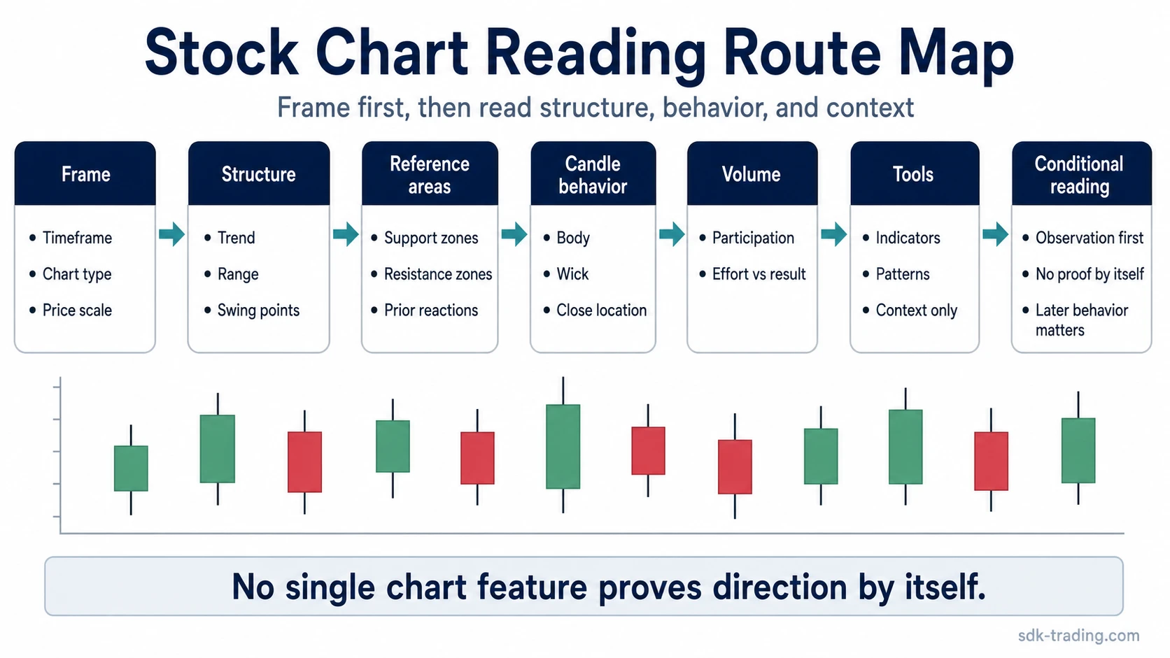
- No single chart feature proves direction by itself.
- Better chart reading starts by separating observation from interpretation.
What a Stock Chart Shows
A stock chart shows how price moved during the selected window. The vertical axis shows price. The horizontal axis shows time. The chart style decides how much information appears for each period.
A daily candlestick chart, for example, compresses each trading day into one candle. A weekly chart compresses each week into one candle. An intraday chart may compress each five-minute or fifteen-minute period into one candle. The market data may be the same, but the reading changes when the timeframe changes.
Chart reading starts with the frame: before interpreting a trend, candle, pattern, or level, identify the timeframe, chart type, price scale, and the part of the move being examined.
The Main Parts of a Stock Chart
| Chart part | What it shows | Common reading mistake |
|---|---|---|
| Price axis | The price levels reached during the selected period. | Treating every nearby price level as equally important. |
| Time axis | The window being reviewed, from intraday periods to weekly or monthly views. | Changing timeframe after forming an opinion. |
| Chart type | The way price data is displayed, such as line, bar, candle, or area format. | Assuming every chart style carries the same amount of information. |
| Price scale | How price distance is displayed visually. | Ignoring how the scale can change the visual impression of a move. |
| Volume | The amount of activity traded during each period. | Treating volume as confirmation without checking price result. |
Main Stock Chart Types
Line charts usually connect closing prices. They are useful for seeing the broad path of price, but they hide intraperiod highs, lows, opens, and selling or buying pressure inside each period.
Bar charts show open, high, low, and close data. They provide more detail than a line chart, especially when the high-low range matters.
Candlestick charts also show open, high, low, and close data, but the body and wicks make the intraperiod behavior easier to compare visually.
Area or mountain charts emphasize the overall price path with a shaded display. They can be useful for broad orientation, but they are less useful when the reading depends on candle structure, rejection, acceptance, or range behavior.
Limitation: chart type changes visibility, not market reality. A line chart may make a move look smooth while the candlestick version shows wide swings, failed pushes, or indecision inside the same period.
How to Read Trend Structure
Trend reading begins by comparing swing highs and swing lows. Rising swing highs and rising swing lows usually describe upward structure. Falling swing highs and falling swing lows usually describe downward structure. When price repeatedly moves between a similar upper and lower area, the structure is more range-bound.
The useful question is not only whether price moved up or down. The stronger question is whether buyers or sellers are still accepting prices beyond prior reference points. That is why market structure matters: it separates the direction of the recent move from the quality of the structure behind it.
| Observed structure | Neutral reading | What still needs context |
|---|---|---|
| Higher highs and higher lows | Price is building upward structure. | Whether the move is accepted or becoming extended. |
| Lower highs and lower lows | Price is building downward structure. | Whether selling pressure continues or starts to fail. |
| Repeated highs and lows in a range | Price is rotating between reference areas. | Whether the range is accepted, rejected, or preparing to expand. |
How to Read Support and Resistance
Support and resistance are reference areas where price has previously reacted. Support is usually associated with lower areas where demand appeared. Resistance is usually associated with upper areas where supply appeared.
These areas are better treated as zones than exact lines. A market may test slightly above or below a prior level before the reading becomes clear. The reaction, close location, follow-through, and later acceptance matter more than the first touch.
Boundary: support does not guarantee a bounce, and resistance does not guarantee a rejection. A level becomes more useful when price behavior around it shows whether the area is being accepted, rejected, or ignored.
How to Read Candles and OHLC Behavior
A candlestick records four prices for one period: open, high, low, and close. The body shows the distance between the open and close. The wicks show how far price moved beyond the body before the period ended.
Candle reading is strongest when it connects the candle to its location. A large candle in the middle of a range may mean less than a smaller candle that appears after a test of a major reference area. Broader candlestick patterns become more useful when individual candle behavior is read together with trend, location, volume, and follow-up.
Some candles show hesitation rather than clean control. A doji, for example, forms when the open and close are very close together. That can reflect indecision inside the period, but its meaning still depends on trend, location, volume, and follow-up behavior.
| Candle feature | What it helps read | What it does not prove |
|---|---|---|
| Body size | Distance between open and close. | That one side has lasting control. |
| Upper wick | Price moved higher before closing lower than the high. | That resistance must hold. |
| Lower wick | Price moved lower before closing above the low. | That support must hold. |
| Close location | Where price finished relative to the full range. | That the next period must continue in the same direction. |
How to Read Volume
Volume shows participation. Rising volume means more activity occurred during the period. Falling volume means less activity occurred during the period. The interpretation depends on what price did while that activity appeared.
High volume with strong price expansion can show broad participation in the move. High volume with little price progress can show friction, absorption, or disagreement. Low volume during a pullback can have a different meaning than low volume during a breakout attempt.
Volume needs price result: volume alone does not confirm a chart reading. The stronger reading compares effort, direction, range, close location, and later behavior.
How Indicators Fit Into Chart Reading
Indicators summarize or transform price and volume data. They can reduce noise, highlight trend direction, or show momentum and participation from another angle. They can also add clutter when they repeat the same information or conflict without a clear reason.
A simple moving average is one common overlay. It smooths price over a selected number of periods, which can make trend direction easier to see. It does not turn a chart into a buy or sell signal by itself.
Indicator limit: an indicator is a lens, not a verdict. The reading is stronger when the indicator helps clarify structure, timeframe, trend, and location rather than replacing them.
How Chart Patterns Fit Into Stock Chart Reading
Chart patterns are repeated structural shapes that appear when price movement forms recognizable highs, lows, ranges, breaks, or failed attempts. They can help organize chart behavior, but they should not be treated as automatic outcomes.
A head and shoulders pattern, for example, is usually read as a possible transition structure when the surrounding trend, neckline behavior, acceptance, and follow-through support that interpretation. The shape alone is not enough.
Pattern limit: the name of a pattern is less important than the behavior around it. A pattern weakens when the market fails to accept the expected break, when volume contradicts the reading, or when price quickly returns into the prior structure.
A Practical Sequence for Reading a Stock Chart
- Set the timeframe: decide whether the chart is being read as intraday behavior, short-term structure, weekly trend, or longer-term context.
- Identify the chart type: line charts simplify; candles and bars show OHLC behavior.
- Mark the visible trend structure: compare swing highs, swing lows, and range boundaries.
- Identify reference areas: note where price previously reacted, stalled, accepted, or rejected.
- Read candles in location: compare body, wick, range, and close position at important areas.
- Compare volume with price result: ask whether activity produced progress, rejection, compression, or rotation.
- Use indicators only for context: keep overlays limited to what helps the reading.
- Separate observation from conclusion: record what the chart shows before deciding what it may mean.
Example scenario: price reaches a prior resistance area, forms a candle with a long upper wick, and closes back below the area on higher volume. That does not prove a reversal. It shows that higher prices were tested and not accepted during that period. The reading becomes more meaningful only if later candles fail to reclaim the area or if downside structure begins to develop.
Stock Chart Reading Route Map
| Chart element | What it helps read | What it does not prove | Where to go next |
|---|---|---|---|
| Timeframe | The window being analyzed. | That another timeframe agrees. | Compare the same structure across nearby timeframes. |
| Chart type | How much price detail is visible. | That one display is always better. | Use candles or OHLC bars when intraperiod behavior matters. |
| Trend structure | Whether price is building higher, lower, or range-bound structure. | That the next swing must continue. | Market structure. |
| Support and resistance | Where price has previously reacted. | That a reaction must repeat. | Read acceptance, rejection, and follow-through around the area. |
| Candles | Open, high, low, close, body, wick, and close location. | That one candle decides direction. | Doji and other candlestick structures. |
| Volume | Participation and activity intensity. | That activity confirms a trade by itself. | Compare effort with price result. |
| Moving average | Smoothed trend reference. | That crossing a line is automatically meaningful. | Simple moving average. |
| Chart patterns | Repeated structural shapes. | That a target or reversal is certain. | Head and shoulders pattern. |
Common Mistakes When Reading Stock Charts
| Mistake | Safer interpretation |
|---|---|
| Reading a chart as a prediction | A chart organizes prior price behavior. Any forward reading remains conditional. |
| Changing timeframe to fit a view | Timeframe should be chosen before interpretation, not after the chart becomes inconvenient. |
| Treating support and resistance as exact lines | Reference areas usually need reaction, close location, and follow-through before the reading improves. |
| Calling every wick rejection | A wick begins the question; later behavior decides whether the area was actually rejected. |
| Using too many indicators | More overlays can create duplicated or conflicting signals without improving the chart reading. |
| Forcing pattern names onto every structure | A pattern name is useful only when the surrounding behavior supports the structure. |
FAQ
What is the first thing to look at on a stock chart?
Start with timeframe, chart type, and the visible price structure. Those three details shape how every candle, level, volume bar, indicator, or pattern should be read.
Do stock charts predict future prices?
No. A stock chart records prior price behavior and helps organize current structure. Any forward interpretation remains conditional and can change as new price behavior appears.
Why can two traders read the same stock chart differently?
They may be using different timeframes, focusing on different reference areas, weighting volume differently, or interpreting the same candle inside different market structure.
Does high volume confirm a chart reading?
High volume shows activity, not certainty. The stronger reading compares volume with price result, range, close location, and what happens afterward.