A point and figure chart is a non-time-based charting method that records price movement in columns of Xs and Os. The chart updates only when price moves enough to satisfy the selected box size or reversal amount, so regular time spacing and some intraperiod detail are filtered out.
Definition: A point and figure chart, often shortened to P&F, displays rising price movement with X columns and falling price movement with O columns. It focuses on price movement that meets defined construction rules rather than placing every candle, bar, or time interval on a regular time axis.
The construction rule is direct: price must move by at least one box before the current column extends, and it must reverse by a defined number of boxes before a new opposite column begins. That makes the chart useful for studying filtered price structure, but it also means the display is not a complete record of every trade, gap, wick, or time-based sequence.
Key Points
- A point and figure chart uses Xs for rising columns and Os for falling columns.
- Box size controls how much price movement is needed before a new mark is added.
- Reversal amount controls how much opposite movement is needed before a new column starts.
- The chart is not plotted with regular time spacing, so quiet periods and active periods can look visually compressed.
- P&F structure can help organize support, resistance, trend lines, and patterns, but it is not a standalone trading signal.
What Is a Point and Figure Chart?
A point and figure chart is a price-movement chart rather than a time-sequenced candle chart. Standard candlesticks usually show open, high, low, and close data for fixed intervals. P&F removes that regular interval structure and records only movement large enough to pass the chart settings.
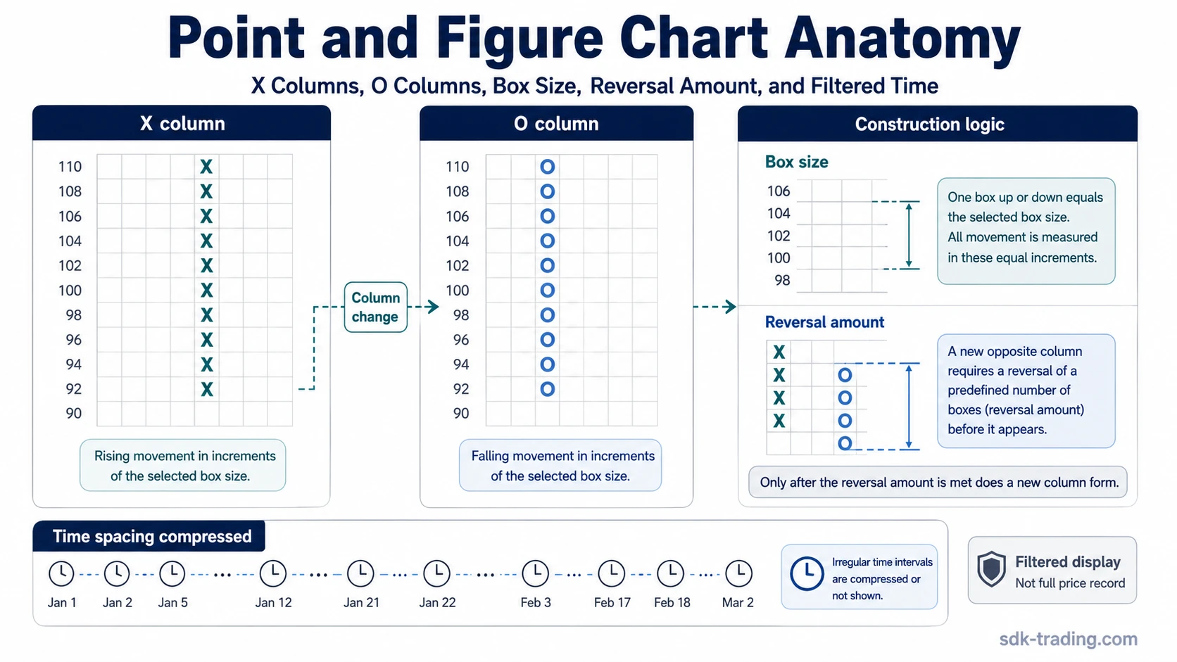
The result is a filtered chart made of vertical columns. A column of Xs represents rising price movement. A column of Os represents falling price movement. The chart changes direction only after price reverses by the required amount, so small back-and-forth movement may never appear as a separate column.
Important boundary: P&F does not remove uncertainty. It changes how price movement is displayed. A cleaner-looking structure can still hide timing gaps, intraperiod volatility, and failed attempts that would be visible on a standard time-based chart.
How X and O Columns Work
Xs and Os are the basic visual language of point and figure charting. Xs appear in a rising column when price keeps moving upward by enough boxes. Os appear in a falling column when price keeps moving downward by enough boxes. The columns alternate because an X column cannot contain Os, and an O column cannot contain Xs.
| Element | What it shows | What can be misread |
|---|---|---|
| X column | Filtered upward price movement that meets the box-size rule. | It does not mean every moment inside that move was smooth or tradable. |
| O column | Filtered downward price movement that meets the box-size rule. | It does not show every bounce, wick, or smaller counter-move inside the decline. |
| Column change | A reversal large enough to satisfy the reversal setting. | It is a display change, not proof that the next move will continue. |
Because columns alternate, P&F can make the direction of filtered movement easier to see. That clarity is also the main limitation: a chart that filters noise can also filter information that matters in execution, volatility analysis, or raw price review.
Box Size and Reversal Amount
Box size is the minimum price movement needed to add another X or O. A smaller box size creates a more sensitive chart with more marks. A larger box size creates a more selective chart with fewer displayed changes.
Reversal amount is the amount of opposite movement required to start a new column. It is often described in boxes, such as a three-box reversal. If the chart uses a three-box reversal, price must move three boxes in the opposite direction before the chart changes from an X column to an O column, or from an O column to an X column.
Illustrative example: With a 1-point box size and a 3-box reversal, price must move by 1 point to add another mark in the current column. It must move 3 points in the opposite direction before a new opposite column begins. The example shows construction logic only; it does not create an entry, exit, target, or probability estimate.
The relationship between box size and reversal amount controls how much price movement is visible. A sensitive setting may show more changes and more potential patterns. A larger or less sensitive setting may hide smaller swings and show only broader movement.
How Point and Figure Chart Construction Works
P&F construction follows a sequence of rules. The chart first needs a box size, a reversal amount, and a price input method. After those choices are set, the chart checks whether price has moved enough to extend the current column or reverse into a new one.
- Choose the box size: This sets the price increment represented by each X or O.
- Choose the reversal amount: This sets how many boxes price must move in the opposite direction before a new column appears.
- Apply the price input method: Some charts use closing prices only, while others use high-low data depending on the method selected.
- Extend the current column: If price continues far enough in the same direction, the current X or O column grows.
- Start a new column after reversal: If price reverses by the required number of boxes, a new opposite column begins.
This process explains why the same market can look different across different P&F settings. The chart is not only showing price movement; it is showing price movement after a filter has been applied.
Common Point and Figure Chart Settings
Point and figure charts often include several setting choices. These choices affect what appears on the chart and how sensitive the display becomes. They should be treated as construction settings, not as universal answers.
| Setting | What it controls | Interpretation boundary |
|---|---|---|
| Traditional scaling | Uses predefined box-size logic, often tied to price ranges. | It can make charts comparable within a convention, but it is still a selected rule. |
| Percentage scaling | Defines boxes as a percentage movement rather than a fixed price amount. | It can adjust better across price levels, but it changes sensitivity. |
| ATR or dynamic scaling | Uses a volatility-based or changing box size. | It can adapt to volatility, but the chart may shift as conditions change. |
| User-defined scaling | Uses a fixed box size chosen by the chart user. | The chosen value can strongly affect visible structure. |
| Close-only method | Uses closing prices for construction. | Intraperiod highs and lows may be ignored. |
| High-low method | Uses intraperiod high and low data when evaluating boxes. | More movement may appear than in close-only construction. |
No setting is universally best. The setting should match the analytical purpose, and any conclusion should be checked against what the chosen construction method may have filtered out.
What Point and Figure Charts Filter Out
The strongest difference between point and figure charts and time-based charts is not the use of Xs and Os. It is the filtering rule. A P&F chart does not show each regular trading period in sequence. A day, hour, or minute with no qualifying price movement may add nothing to the chart, while a more active period may add several marks.
Limitation: P&F structure can hide regular time spacing, smaller failed moves, some intraperiod detail, and the exact path price took between displayed marks. The chart can make structure easier to inspect, but it should not be treated as the full market record.
This matters because filtered displays can look more orderly than raw price. A clean X or O column does not prove that movement was easy to trade, that liquidity was stable, or that the raw chart had no gaps or rejection behavior.
How Traders Read P&F Structure Without Treating It as a Signal
Point and figure charts are commonly used to organize support, resistance, trend lines, and chart patterns. These are interpretation surfaces. They help describe displayed structure, but they do not make the chart predictive by themselves.
Support and resistance on a P&F chart usually come from repeated columns or turning areas. Trend lines may be drawn from the displayed columns. Patterns may appear when columns form recognizable structures. Those readings still depend on settings, context, and confirmation from the broader chart review.
Diagnostic use: A safer reading is to ask what the chart displays, what the settings filtered out, and whether the same idea remains visible on raw price or another chart format. The chart can support interpretation, but it should not replace risk controls, context review, or independent confirmation.
Point and Figure Chart Patterns and Nearby Chart Types
Some P&F users study formations such as columns, congestion areas, breakouts, and other displayed structures. Detailed point and figure chart pattern interpretation focuses on how those formations are read after the box size, reversal amount, and displayed column structure are already understood.
P&F also sits near other non-time-based charting methods. A line break chart also filters time-based noise, but it uses different rules for displayed line changes. Renko and Kagi charts filter movement through their own construction logic. These chart types can share a broad goal, but they should not be read as if their rules are interchangeable.
Common Mistakes With Point and Figure Charts
| Mistake | Safer interpretation |
|---|---|
| Treating every column change as a signal | A column change shows that the reversal setting was met. It does not prove continuation. |
| Ignoring box-size sensitivity | Different box sizes can create different visible structures from the same underlying market. |
| Assuming filtered structure equals cleaner execution | The chart may hide gaps, rejected moves, and timing details that still matter in practice. |
| Using price objectives as predictions | Objective methods are traditional interpretation tools, not guaranteed targets. |
| Skipping raw price comparison | Raw price can show details that P&F construction compresses or omits. |
FAQ
What does a point and figure chart show?
A point and figure chart shows filtered price movement in X and O columns. It shows movement that meets the selected box size and reversal amount, rather than every regular time interval.
What do Xs and Os mean on a point and figure chart?
Xs usually represent rising price movement, while Os represent falling price movement. Each mark appears only when price movement satisfies the chart settings.
Is a point and figure chart time-based?
No. A point and figure chart is not plotted with regular time spacing. It updates when price movement meets the construction rules, so time can be compressed or absent from the visible structure.
Does a point and figure chart give trading signals?
No. P&F structure can help organize interpretation, but it should not be treated as a standalone signal, prediction method, or complete trading system.