A Kagi chart is a non-time-based price chart that changes shape only when price movement meets a selected reversal amount. It does not plot each candle, bar, or equal time interval. Instead, it draws a connected line that continues in the current direction until price reverses by enough to create a new directional segment.
The useful point of a Kagi chart is not prediction. It is a filtered display of price movement. The chart can help a reader separate larger directional movement from smaller fluctuations, but the result depends heavily on the reversal setting and should not be treated as a standalone trading signal.
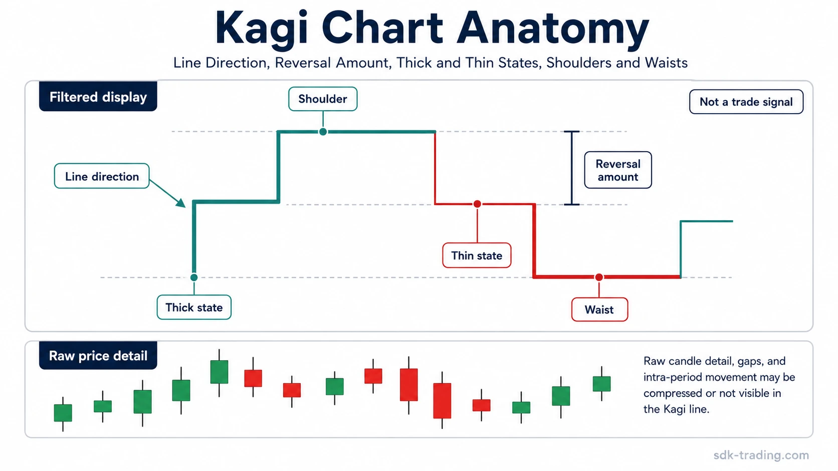
Key Points
- A Kagi chart is built from price movement rather than equal time spacing.
- The reversal amount controls when the line changes direction.
- Thick and thin line states, sometimes called yang and yin, change when price crosses prior turning levels.
- Shoulders and waists mark prior turning areas, not automatic trade instructions.
- Kagi charts can hide time, gaps, and intraperiod price detail, so raw price should be checked when precision matters.
What Is a Kagi Chart?
A Kagi chart is a price-filtering chart type used in technical analysis. Unlike candlestick charts, bar charts, and line charts, it does not give every time period the same visual weight. A quiet hour, a volatile hour, and a full session may appear differently depending on whether price movement is large enough to pass the chart’s reversal rule.
Definition: A Kagi chart is a non-time-based chart that draws connected vertical and horizontal line segments according to price movement and a chosen reversal amount. The chart updates when price extends in the current direction or reverses by enough to trigger a new segment.
This makes Kagi different from standard time-based displays. A candlestick chart shows each selected time interval, including opens, highs, lows, closes, gaps, and wicks. A Kagi chart compresses that information into a line structure. That compression can make the larger displayed movement easier to see, but it also removes detail that may matter for execution, volatility, and exact price behavior.
How a Kagi Chart Is Built
A Kagi chart begins with price movement. When price continues in the same direction, the current vertical line extends. When price reverses by less than the selected reversal amount, the chart does not necessarily change direction. When price reverses by at least that amount, a short horizontal connector appears and a new vertical segment begins in the opposite direction.
The reversal amount is the central construction rule. It can be set as a fixed price amount, a percentage move, or a volatility-based measure such as ATR. The larger the reversal amount, the more movement is required before the chart changes direction. The smaller the reversal amount, the more sensitive and active the chart becomes.
A Kagi reversal is a chart construction event. It means price has moved enough to change the displayed line direction under the selected setting. It does not, by itself, prove that the market has entered a tradable trend reversal.
Reversal Amount and Line Direction
Line direction and reversal amount are separate ideas. Direction describes whether the Kagi line is currently moving upward or downward. Reversal amount defines how much price must move against that direction before the chart draws a reversal.
| Setting type | How it works | Main limitation |
|---|---|---|
| Fixed amount | The chart reverses only after price moves by a specific price value. | A value that works on one instrument or price range may be too small or too large on another. |
| Percentage | The reversal threshold is based on a percentage move rather than a fixed price value. | The chart still depends on the chosen percentage and may respond differently across volatile and quiet markets. |
| ATR | The reversal threshold is based on recent volatility. | As volatility changes, the chart may change its sensitivity, which can affect interpretation. |
Two Kagi charts showing the same market can look different if their reversal settings differ. This is why a Kagi chart should be read as a configured display, not as a universal version of price history.
Thick and Thin Lines, Shoulders and Waists
Kagi charts also use line state. Many platforms display this as thick and thin lines. Some descriptions use the terms yang and yin. A line state changes when price crosses an important prior turning level, usually a prior high or prior low in the Kagi structure.
A common interpretation is that the line becomes thick when price exceeds a prior high and becomes thin when price falls below a prior low. The exact display rules can vary by platform, but the concept is the same: direction tells whether the line is moving up or down, while state tells whether the line has crossed a prior structural level.
| Kagi element | What it shows | What not to assume |
|---|---|---|
| Line direction | Whether the displayed line is currently extending upward or downward. | Direction alone does not confirm a tradable trend. |
| Reversal amount | The threshold required to draw a directional reversal. | The threshold is not proof that the underlying market reversed cleanly. |
| Thick or thin state | Whether price has crossed a prior Kagi high or low level. | A state shift is not automatically an entry or exit instruction. |
| Shoulder | A prior upper turning area in the Kagi structure. | It should not be treated as automatic resistance. |
| Waist | A prior lower turning area in the Kagi structure. | It should not be treated as automatic support. |
| Raw price cross-check | A comparison with standard price candles or bars when exact price behavior matters. | The filtered Kagi display should not replace raw price detail. |
How to Read a Kagi Chart Safely
A safer reading starts with the displayed structure. First, check the current line direction. Then check the reversal amount that controls directional changes. Next, identify whether the line is thick or thin and whether that state changed after crossing a prior Kagi high or low. Finally, look at nearby shoulders and waists to understand where earlier turning areas appeared.
This reading process is useful because it separates several things that are often blended together. A direction reversal is not the same as a thick/thin state change. A shoulder or waist is not the same as a trade level. A filtered Kagi line is not the same as raw tradable price structure.
When the reading task moves beyond anatomy into sequence, the how to read Kagi chart workflow separates line direction, reversal amount, thick/thin shifts, shoulders, waists, and raw price checks in a stricter order.
Simple Kagi Chart Example
Suppose price rises from 100 to 110 while the Kagi reversal amount is set to 5 points. The upward Kagi line can keep extending while price continues rising. If price then falls only to 107, the decline is smaller than the 5-point reversal amount, so the chart may not draw a downward reversal. If price falls to 105 or lower, the reversal threshold is met and the chart can draw a horizontal connector followed by a downward segment.
This example only explains chart construction. It does not say that a market should be bought, sold, avoided, or acted on. The chart changed because the configured display rule was met.
Kagi Chart vs Renko and Line Break Charts
Kagi, Renko, line break, and point and figure charts all reduce the visual role of equal time intervals. They are related because they focus more on price movement than on every time-based candle. They are not identical.
A Renko chart builds box-like bricks when price moves by a selected brick size. A Kagi chart uses a connected line and changes direction only when the reversal amount is met. The visual logic is different even though both charts filter smaller movement.
A line break chart also filters price movement, but its construction depends on line-break rules rather than Kagi shoulders, waists, and thick/thin state changes. Point and figure charts use columns of Xs and Os, which creates another distinct price-filtering structure.
The practical distinction is that Kagi emphasizes line direction, reversal amount, and state changes around prior turning levels. Candlestick charts emphasize raw opens, highs, lows, closes, gaps, and intraperiod behavior. Neither view should be confused with the other.
Limits of Kagi Charts
The main limitation of a Kagi chart is that the display depends on settings. A small reversal amount can create frequent reversals. A large reversal amount can suppress smaller swings and make the chart appear smoother. ATR-based settings can also change as volatility changes.
A Kagi chart filters price movement, but filtering is not the same as improving the underlying market signal. The chart may reduce visual noise, but it can also hide timing, gaps, intraperiod rejection, and exact raw-price levels.
A second limitation is platform variation. Different charting platforms may handle calculation details, source prices, ATR settings, and display conventions differently. When a Kagi reading matters, the chart settings should be checked before comparing it with another platform or another trader’s chart.
A third limitation is over-reading. Thick and thin changes can look decisive, but they are still display states. A stronger interpretation usually needs supporting context such as raw price behavior, volatility conditions, broader structure, and whether the move remains accepted after the Kagi shift appears.
Diagnostic Boundary for Kagi Charts
| Question | Safer answer |
|---|---|
| What is a Kagi chart? | A non-time-based price chart built from line movement, reversal amount, and state changes. |
| What is it not? | It is not a complete trading system or proof that a trade should be taken. |
| What changes line direction? | Price must reverse by at least the selected reversal amount. |
| What changes line state? | Price crosses a prior Kagi high or low, causing a thick/thin or yang/yin shift. |
| What strengthens a reading? | The Kagi structure aligns with raw price behavior, volatility context, and broader market structure. |
| What weakens a reading? | The move depends only on settings, conflicts with raw price, or ignores gaps and intraperiod detail. |
FAQ
What is a Kagi chart?
A Kagi chart is a non-time-based chart that draws price movement as connected line segments. The line continues in the current direction until price reverses by at least the selected reversal amount.
How do you read a Kagi chart?
Read the current line direction, the reversal amount, thick or thin line state, and nearby shoulders and waists. Then check whether raw price behavior supports or weakens the filtered display.
What changes a Kagi chart from thin to thick?
A Kagi line usually changes from thin to thick when price crosses a prior Kagi high. It may change from thick to thin when price falls below a prior Kagi low, depending on the platform’s display convention.
Is a Kagi chart the same as a Renko chart?
No. Both are non-time-based chart types, but a Renko chart builds bricks from price movement, while a Kagi chart uses connected lines, reversal amounts, and thick or thin state changes.
Does a Kagi chart give trading signals?
A Kagi chart can show filtered price structure, but it should not be treated as a standalone signal system. Interpretation depends on settings, raw price behavior, volatility, and broader context.